The Column Chart is a vertical bar graph that represents categorical data in rectangular bars with heights proportional to the values that they represent.
The Column Chart shows comparisons among discrete categories. It is a two-dimensional graph in which one axis of the graph shows the specific groups being compared and another one represents the measured value.
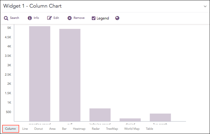
Count of logs grouped by source_port
The following query gives the output shown above.
| chart count() by action limit 5
The Column chart supports two aggregation response types for representation of search results in the visualization. They are:
Response Type |
General Syntax |
|---|---|
| chart aggregation_parameter by grouping_parameter1, grouping_parameter2, ........, grouping_parametern
|
|
| timechart aggregation_parameter
|
In the Single Aggregation with Grouping response type, the x-axis of a Column chart represents the values of the grouping parameter(s) whereas the y-axis represents the values of the aggregation parameter.
Example:
severity=* | chart count() by severity order by count() desc limit 5
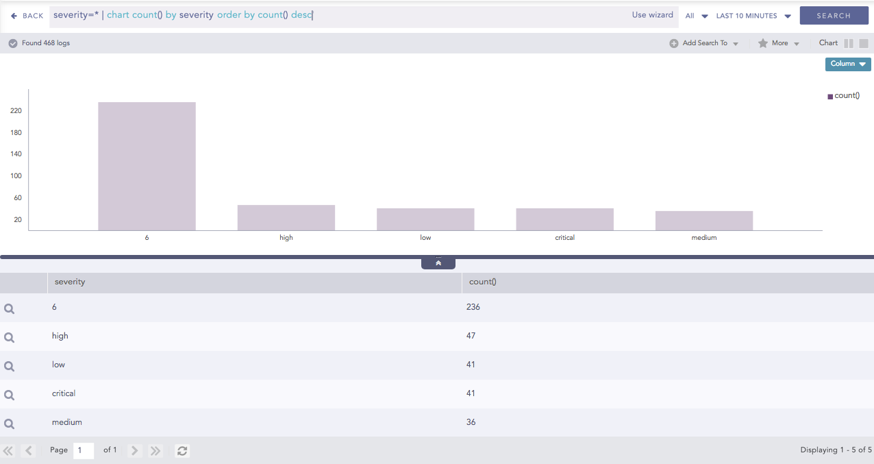
Column chart for Single Aggregation with Grouping
You can refer to Single Aggregation with Grouping for more details.
In the Timechart Single Aggregation without Grouping response type, the x-axis of the Column chart represents the value of timestamps whereas the y-axis represents the values of the aggregation parameter.
Each bar represents the value of the aggregation parameter in a given Interval. The Interval is calculated automatically as per the time range selected in the Search Bar . The value of the *Interval is displayed on the extreme left of the container.
Example:
| timechart avg(datasize)
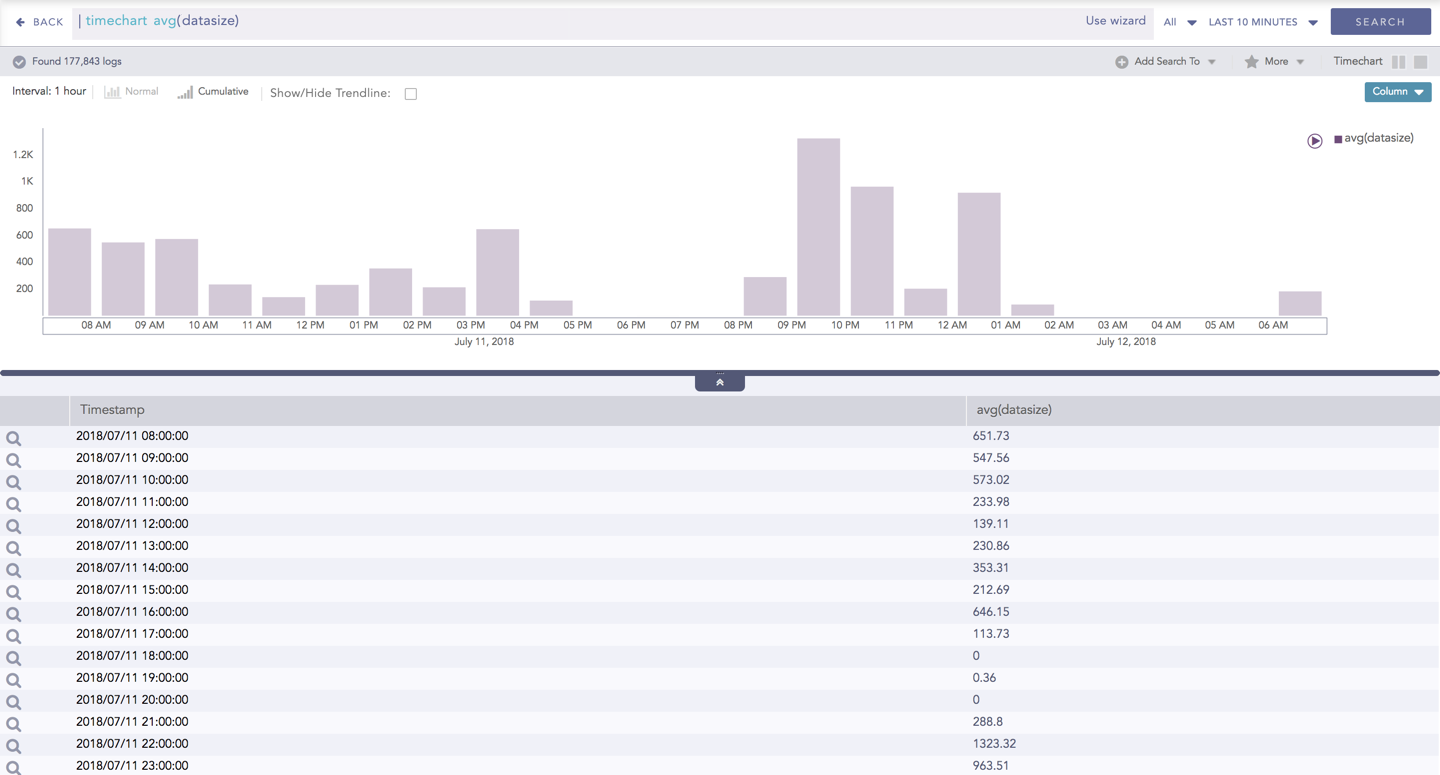
Column chart for Timechart Single Aggregation without Grouping
You can refer to Timechart Single Aggregation without Grouping for more details.